

Welcome to the Layer Cake Pop Quilt Along hosted by Fat Quarter Shop. I am Denise Russell and I am so happy I accepted the invitation to participate in the quilt along, as it was a pleasure to make this sunny beauty!

The Layer Cake Pop pattern is perfect for featuring gorgeous prints like these and it is very easy, so this quilt came together super fast. I used a layer cake of Kaffe Collective Spicy Palette and, I think, the perfect background color to make all of Kaffe‘s colors pop: yellow!

The yellow fabric is organic cotton by Cloud 9 Fabrics, of which I have an entire bolt. Our days here have been so cloudy and snowy – nothing like lots of bright colors to cheer us up!
Fat Quarter Shop has an awesome quilt kit for this project using the beautiful Spectrum collection by V and Co for Moda Fabric. (See below for giveaway).
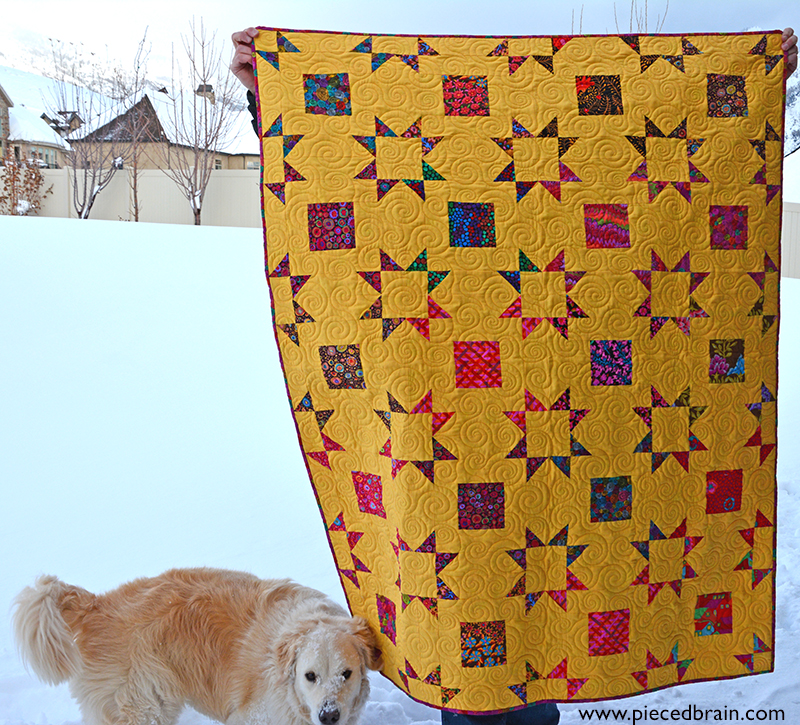
Toby the photobomber was having a ball playing with the snow while my husband held the quilt for the photograph, which also shows the handiwork of Melissa from Sew Shabby Quilting. She chose a great quilting motif to add texture to the background, contrasting the straight lines of the blocks with a beautiful swirl pattern. Lovely, Melissa, as usual!
Speaking of background for blocks, tell me: how do you decide which fabric to use for background on your quilts? Leave me a comment for a chance to win a Spectrum layer cake, courtesy of Fat Quarter Shop.


Aren’t these fabrics cool? Imagine how your Layer Cake Pop quilt would look using this happy line! If you are a noreply blogger, make sure I have a way to contact you by leaving your email as “soandsoatanymaildotcom” (so you don’t get spammed). Winner will be announced on Monday, January 30.
Now, head over to FQS’s blog to see all the other Layer Cake Pop quilts by participating bloggers.
Thanks for stopping by, and have a colorful day!

I love how bright and happy yours is with the yellow background! I never would have used such a blod color, but it looks wonderful!
Thank you! I went for Bright and Bold on this one. Loving this quilt!
Love the yellow background! This pattern is so great! I like to pick a background that isn't very common usually.
I know, right? I thought that white or gray would not do justice to Kaffe's prints…
A wonderful bright quilt! It depends on the design, but I often choose grey or white/cream as my background color. The boldest background I have used is navy. I hope to be brave enough one day to use a bright background color!
I love you bright background! I have such a hard time choosing backgrounds and usually stay with something safe like cream. I would love to be more bold!
Just go for it. What is the worst that could happen? You won't like it and will have to mail it to me!!!
I always keep it simple for the background. I almost always use a solid color — and I am boring so its usually white, black, or gray… the popping of the color yellow looks fantastic, maybe one day I will become brave and do it!
Go for it, girl!!!
I love the vibrancy of this quilt! Can you tell me what the backing fabric is called? For a background fabric I look for a contrast that appeals to me, keeping in mind where I want to use it. I'm not afraid of colour!
Thank you! The background fabric I chose is called Red Rolled Paper by Kaffe Fassett. It think it was perfect for the backing of this quilt.
Wow, Denise is that beautiful and the yellow really makes it pop! I usually use neutral colors but I'm going to have to get braver. Thanks for sharing.
I usually go with a neutral background or one of the minor colors in the fabrics. I love the yellow you used. Time to branch out I think!
Beautiful quilt! I would mainly use lighter shades, but am currently thinking of using navy blue.
[email protected]
That yellow was a wonderful choice to go with those bright colors!
When I choose a background fabric, it is usually a tone on tone or very simple pattern that goes with the other chosen fabric. A lot of times it is black, grey or white. I have a hard time making super bold choices if there is a lot of background, but I am trying.
I mostly use white or off white, but just bought some grey to try.
I also like to use background fabrics that make the rest of the colors pop,but generally grey, black or whitish. I'm doing one now that is using Navy and that's a first.
That yellow background is lovely! I usually use white, cream, grey or navy-depends on the other fabrics I'm using. Never used yellow though!
Wow your version is gorgeous!!!! I'm not sure exactly how I decide. Sometimes I want to do a scrappy low volume and sometimes I just use what I have on hand which happens to be a bolt of Kona white and snow. But I do mull over my fabric choices for a long time usually before diving in!
I mostly use white and a few with gray. I now have a stash of text fabric so I am going to try that next. I think I just need to jump in and start using other colors. Maybe this project will be my inspiration!
Love the yellow background!
[email protected]
That is an amazng quilt, just right for these grey days! Yay! I am not sure probably I am more a scrappy quilter. But if I have to choose it would have to be a color which ist soehow used in the quilt and just lets pop up the pattern.
Love the yellow background you used for your beautiful quilt!
Normally I use a white or white with small pattern background but it depends on the fabrics I use and which story I want to tell with my quilt.
Wish I could be more daring and use brighter background colours like this yellow!
I am so excited to see that someone created this quilt in a non-white background – it is fantastic!
I choose my main fabrics for a quilt and then audition various background fabrics. The impact of the various fabrics is always fascinating. Sometimes I have settled on a background that I would never have considered. Of course, sometimes I am practical and choose background based on what I have "enough" of. Thanks for the giveaway.
Love the bright quilt background! I use non-white or dark contrasting colors for backgrounds of my quilts.
nikilsend(at)outlook(dot)com
Love this quilt. I usually have my granddaughter come over and help with background color. She h as an eye for colors. Thanks for the giveaway.
Truthfully I would go with what I had available, such as sheets or piecing large pieces. dawnm1993(at)gmail(dot)com
I like to choose a background that makes the colors in the quilt pop! I audition the fabrics on the background color I am considering. I absolutely love the yellow you used with the Kaffe fabrics!!
I just downloaded this pattern and I'm starting it today my first thoughts for background fabric is usually white or gray but after seeing your beautiful version I'm wanting to try something bolder…not sure what yet but thanks for the inspiration!!
Love your quilt. I have never gone that bold with a background color but the yellow surely makes those Kaffe prints pop off the quilt. I also really like the quilting motif. I generally use white, bone or a shade of grey for my backgrounds. Those are the colors I usually purchase by the bolt. Seeing your quilt, I may have to re-think color choices. I have a beautiful jelly roll with bright "tribal" prints. It might look amazing using a shade of orange or a sapphire blue for the background!
I love this sunny quilt. I choose background fabric that is a little unusual. I made a color challenge quilt using cheddar as the background and I am now using a linen cotton blend which creates beautiful texture.
It is hard for me to choose background colors, I am still new at this and don't seem to have a lot of good color sense. I hope it is something that will develop as I venture on, but for now I rely a lot on amazing quilt blogs like yours. 🙂
Your quilt just simply stands out. It is so nice to see a different background instead of the usual white or black. You choose a color that makes your quilt beautiful. Thank you for the chance to enter and try to win. Printed out the quilt pattern. Will be making this one for myself.
Sandi Timmons
[email protected]
This is such a cute pattern. When choosing a backing fabric I like to pick from the colours on the front and I love bold vibrant colours.
beautiful. thanks for sharing.
Wow, the yellow background is fabulous! I am just starting to venture beyond classic white or cream backgrounds. I've been experimenting with low volume neutrals (not always successfully) and some color. I'm just finishing my brightest ever quilt with a deep aqua solid as the background. I take my focus fabrics to my local quilt shop and look for the color that makes them pop.
When I am deciding on a background color I usually look for something that will have good contrast with the fabrics used for the blocks. I also like scrappy backgrounds.
I am a big fan of low value solids that are versatile for any focus fabric. So I have a stash of white, cream, and gray and while I should probably learn to branch out, I like them!
Wow! I love the yellow! Looks like a totally different quilt.
Love the yellow, it's a beauty 🙂
wow this is fun and bright and happy. I love the fabrics you chose. perfect for a baby or young one. LOL oh heck I would love one this bright and fun. LOL
I'm so glad you used Kaffe prints! When I saw this pattern earlier today my first thought was I wonder how it would look using Kaffe. Now I know! Lol. It looks great with the yellow background. I usually go with a solid neutral for my backgrounds but I'd like to branch out and use some color like you did with this quilt. Thanks for the chance to win! sarah123quilt (at) gmail {DOT} com
I don't use a lot of yellow in my quilts but your quilt is stunning!
I love Kaffe and try to not use white backgrounds. I love the yellow. I am starting a king size Kaffe quilt for our bed – no background, but I have used beige, gray and green backgrounds when needed as well as black. Love your quilt.
I'm obsessed with grey background which makes my choice easy in a way 🙂
I love to use different colors for the background and really what I use is based on what I'm making. I usually go for a good contrast.
ramonamurray1959atgoogledotcom
What a gorgeous quilt! Screams of Summer!
I've only done quiet backgrounds so far–mostly cream, or ecru. I need to get over the fear, and go bold!
I try to find neutrals but not always white, so usually a gray tone. email [email protected]
Your quilt just POPS OFF THE PAGE with the bright yellow background!!! Yikes, I would never have had the courage but I love it, especially paired with Kaffe prints. I am usually in the safe zone, last background I used was lots of low volume prints but I did pair them with BRIGHTS, so I guess I did stick my toes out of my safety zone at least ONCE…lol! Thanks for the chance for a giveaway.
Like some of the others, I go for the neutral (for me = cowardly)backing. If I'm making a quilt for one of my grandsons, I would go for a more "grunge-proof" color. I hope to branch out to more interesting backings soon.
I love your quilt. It jumps off the screen at me! 😎
LOVE the background color!!
I try to choose a fabric that is not too busy and has enough contrast to let my main fabrics shine!
I love the yellow! It really gives it a pop! I choose my backgrounds usually on how much yardage I have in my stash. I buy yards when they are on sale and keep them on hand usually nothing to busy. Love your quilt!
Lately I have been using scrappy very light backgrounds. However, having seen this beautiful quilt with yellow background, it is defintely time to re-think that! GORGEOUS!
I've almost always used white or cream. I need to try some other colors. This one turned out beautiful! Thank you, [email protected]
I'm usually quite matchy-matchy. I try to become more adventurous in my color choices.
I love the yellow background! I'm trying to be braver and use colourful backgrounds more often!
I started out using mostly creams and whites, but lately I have been using a lot of gray.
I like the background to be "lighter" than the front.
So pretty.
I spend hours auditioning color and fabric choices… when the RIGHT one makes its entrance, I know in a minute that it belongs to the group of fabrics chosen for the blocks… and for the most part that moment of AHHH is the right choice…but I will admit there have been times I had a change at the very last minute because a special fabric seemed to jump out at me and shout that it was the one I should use so I do at times second guess.
Love that yellow background! Totally unexpected and beautiful! I've been really trying to get away from using solid white backgrounds but need to get braver like you!
Sandy N
explabgirl(at)yahoo(dot)com
I always use white or blue background and your yellow is an eye catching.
I love your quilt, especially the bright background fsbric! I have tended to be WAY too conservative eith backgrounds but have just bought a very bright pink for a baby girl quilt background. Breaking out of my comfort zone!! [email protected]
I usually use neutral colors as a background, but once in a while I surprise myself and use a color. I love the look of your quilt with the yellow, but I don't know if I'm brace enough to use yellow. ?
It's easy for me because I only ever want to make quilts with white or low volume backgrounds. I should branch out but I just love the way my quilts look all bright and white! (And having a mostly white cat makes it practical too.)
Great color choice and that backing fabric is drop-dead gorgeous! I just eye ball the background fabrics by setting my other fabrics next to a few to see what I like best. It's usually one fabric that manages to stand out most and that's the one that gets my vote!
I LUV your bright Layer Cake Pop quilt version! Background fabric choice really sets the tone for a quilt. Sometimes I opt for a neutral background. Other times I opt for CONTRAST. My backgrounds can also be a print, i.e. when I used Grunge colors for my quilt blocks.
Wowza, awesome quilt! I usually choose a background fabric that coordinates with the prints. After seeing how your quilt really POPS, I'll be stepping outside of my comfort zone to create a bright, bold quilt.
That is an interesting question because often, with me, it is the background fabric that picks what I use for the rest.
I like to audition backgrounds with what ever fabric I am using, although I will admit to using some form of "neutral" or black for my backgrounds. However, Freddie Moran says that red is a neutral, so go for it right!?
Eu gosto da ousadia da cor,a mais forte que já fiz foi vermelho com pastéis,um contraste inverso,né?Normalmentes branco e beges.BeijoGrande!!!
After I've selected my featured fabrics I audition various backgrounds and choose the one that makes all the others pop!
I like to use a different background color every time, one that matches the mood of the quilt design. Rather than having a pile of white background quilts, I like to have a variety of colors to match seasons and room decor.
Great quilt!! I usually pick the color that I have the most of in my stash… and I try to make it scrappy and fun! Thanks for the chance to win!
Your quilt is so fun with that stunning background. I usually go with something pretty nondescript like a shirting–guess I need to be a bit more daring!
I like scrappy backgrounds – usually in cream or tan – busy light prints. I just bought a big piece of navy polka dot to use as background for a new project though :0)
Love the quilt. The yellow really makes the color pop and inspires me to use a brighter background color. Thanks for sharing.
I like to use a quality flannel fabric in a simple design or colour to coordinate with the quilt front. Sometimes I add a strip of blocks with the extra fabric that I used on the quilt front for tha back.
I like plain colors like tan, grey but I like bindings in polka dots or stripes cut on the diagonal.
Gorgeous quilt! I love Kaffe Fassett fabric and ironically for me to love bright fabrics, I play it fairly safe with neutrals for the background. jarvenpa1ne at gmail dot com
It depends on the quilt what I decide to use for the background. I've been finding more and more I prefer Kona Nautical to the more traditional neutrals. Love the Kaffe fabrics!
Loooove your Sunshiney background!!! 🙂 I have never used a bold color..yet! giggle… But haven't been so daring… my Daughter has been encouraging me tho!! I go to tone-on-tone creams & white..& sometimes soft/light colored tone-on-tones.
Thank you for chance to win your Give-a-way! 😀
I pick out a colour from the fabrics I am using! I chose Chinese Red as a background for blocks made with Denyse Schmidt fabrics to great effect! Your quilt certainly 'pops'!
I choose my background color based on how much contrast it has with the blocks so that it doesn't hide the focal point.
I Love the colors of your quilt especially the yellow, which is my favorite color. I usually use white or ivory as my background because I always have them in my stash. Because of your amazing use of color in this quilt I thing I will start adding some color to my backgrounds. Thanks for the inspiration.
Mostly it is what I feel like. I use a lot of tone on tones, black sometimes and white rarely anymore. Jmikebalouataoldotcom
I can't choose online, I have to hold fabrics together and go from there ? Absolutely love your quilt – so cheery!
It really just depends. I like to use gray a lot it just seems to pop colors. I am totally in love with this quilt of yours and the bright yellow. I recently did a bright pink background and loved it. I think I might start really branching out.
I like for the quilting to show so I usually go for white for the background, but I can see by your quilt that any solid will work. Love your sunny background.
I love your quilt! It is so happy that it makes me smile. I usually just go with a fabric that contrasts nicely with the blocks. Thanks!
Please click on the delaineelliott above for my email link.
I try to look for a color that will make the main colors pop. I've used yellow before–it was fantastic–gray, cream, white. Also, I don't necessarily use a solid, but something that may read as a solid. Your quilt makes me smile. Love it!
I usually look for something with a bit of interest, a low volume. If I go with a solid, then my mind is jumping ahead to the FMQ possibilities! Your rendition of this pattern is truly beautiful! Would never have thought to put Kaffe on yellow but wow! You're right, it's perfect.
Yellow is the perfect foil for such happy brights!! Especially against the snow. Fun pattern too 🙂
I love the yellow you chose. I tend to look for fabrics that aren't white for my backgrounds. I have two dogs and one is known for his muddy feet, so white doesn't stay white in my house for very long. I usually pull out my trusty Kona color card and start laying fabrics against it.
I tend to use white as the boring background. The only times I have used something else were when I had some very pretty fabrics that wrer subtle enouch – a pale green print and a yellow. I am boring.
Your yellow background is great! So glad to see something other than white or gray!
I like to use a color that echos some of the colors from the front of the quilt. And I really like scrappy backs. If I have an extra block or scraps of fabric left from the front I like to incorporate them in the back too. I love bright quilts for the winter too. Thanks.
I vey seldom make quilts with neutral backgrounds. I've used yellow, blue,lime green and occasionally black or navy. Your quilt just jumps off the screen at me and I love it!
I have a hard time picking background fabrics– I love color, but sometimes struggle with which color would work best with my other fabrics! I adore your yellow background.
Wow! That yellow is so lovely and bold! I usually go find a tan or a black tonal that goes with the other fabrics.
I think clear colors like those in Spectrum require a white background. However, using a different colored background makes a quilt pop as it does in your quilt. Love, love, love!
I take my blocks or pieced quilt outside…….in the sun.
If it's not bright enough for my eyes, I too add yellow or golds to make it pop. If it needs toning down…light turqoise for me. Thank you Denise, love K Fassett and all his bold dramatic collection.
bluestarof2(at)yahoo(dot)com
I usually use a white or cream tone on tone for backgrounds. I love the yellow. I need to get out of my comfort zone.
I love your cheery background against the background of snow!Your quilt and your photos are gorgeous! As for backgrounds, I usually choose whatever I've bought the most quantity of lately because it was on sale. I start with that and then coordinate the block colors with it. Thanks for sharing your beautiful quilt!
Your quilt looks spectacular! Your question about selecting backgrounds is interesting, as are all of these responses. I generally try to shop my stash whenever possible. That is my top priority. Then I take advantage of sales for neutrals that will be generic enough for backgrounds on most quilts I intend to make. Whenever I get an idea for a "different" background such as your gorgeous, bright yellow, I will see what I've got in my stash and then build a quilt around that. I found you today through the link-up at Crazy Mom Quilts. Nice to meet you! 🙂 I'm [email protected]; blog is Jayne's Quilting Room.
Love that bright yellow! I typically use a solid or tone on tone white or off-white for background. Although lately, I've made a couple of Civil War Reproduction fabric quilts and I used a variety of lighter shirting prints for the backgrounds. I really like the way they look. Thanks for the chance to win . 🙂
Just love your quilt! Can picture it here at the beach looking real"summery". I generally use neutrals or low volumes for backgrounds but this is inspiring me to use color. Thanks. [email protected]
I use a solid that goes with the main part, that I like. Thanks for the chance to win!
[email protected]
I love your bold use of color on this quilt. It is a fun quilt to make and I want to try it. I try to think about what mood I want to create with my quilt. I like to have a background that is a bit unexpected, like your yellow, but one that has some interest texturally. I love the quilts that have lots of neutrals in the background and then an applique or something interesting as the main focus. Thanks- K- [email protected]
Very pretty! I am boring and usually use cream or white background, sometimes off white batiks. [email protected]
I usually use grey white or navy and black – but I am loving the bright! awesome!
I, too, play it safe when choosing backgrounds. Love this bright, cheerful quilt!
Nearly every quilt I have ever made used white as the background. However, there are a few quilts that I chose a different color. One such quilt was all black, white, and grey. I wanted to give it some color, so I found a little bit of fabric with black, white, grey, and cerulean. I then made the block using cerulean as the sashing between all of the pieces. I was so nervous to use such a bright color. However, it is my very favorite quilt that I have made thus far. powersjlc at gmail dot com is where you can locate me if I am the lucky winner. Thanks so much!
I like to audition backgrounds for my quilt by simply laying blocks or the fabrics I plan to use on top of potential backgrounds. It is so easy to see what could work and what doesn't. I especially love to use what I call "magic" fabrics for backgrounds. These are fabrics that usually have three or more colors in them often with shades of each color.
Most quilts have white shades for background and some use darks. But this one is so very unusual and stunning with the other fabrics. Quilting mirrors the backing fabric. Just great.
your quilt is beautiful, Denise! I love the yellow background. the bold colors really pop. congrats on a beautiful finish!
also! you are one of my pincushion pattern winners! please email me so I can get your patterns to you. thanks! hope you are having a great weekend!
Those colors are terrific! I've made only one quilt, and the background is brown…
Thanks so much.
If I don't already know what background I am going to use, and I often do, I would audition possible background fabrics by laying out a large piece and putting my other fabrics that are going into the quilt on it to see what it looks like. When the combination 'sings' then that is the one I use.
Pauline
perry94022 at hotmail dot com
I usually use an off white or gray for my background but want to branch out! [email protected]
I usually use an off white or gray for my background but want to branch out! [email protected]
The bright colors are perfect against the white background. My favorite part of the picture is the photobomber though. 😀
And since I didn't answer the question. Oops.
I'll look and see what I have and hold it up and hope I find something that works.
I absolutely love your quilt, especially the brightness of the yellow! I usually go with what I have enough of in my stash, or white is always my fall back option!
I have started to use darker backgrounds with bright colors. Like yours! I also think about how the quilt may be used. Lighter backgrounds for wall hangings that won't be handled.
I am loving your mustard background with the Kaffe prints. Yummy. I don't often use solid white for backgrounds. I was mostly a creamier kind of person but with some additional texture to the cream such as Stonehenge prints. I am loving the Moda Grunge line for background now and low volume prints.
tushay3 (at) yahoo (dot) com
Beautiful quilt! I love the color!!!
Most of my quilts are so scrappy that a background color is not a factor. When a background color is called for, I tend to use black, navy, or scrappy creams and beiges. — soparkaveataoldotcom
Love the background. I made a mini modern quilt using that same background along with some Ombré fabric. Turned out great.
I look at the overall quilt and decide what color I want to accent. I love blues so that is usually the winner!
These colors are amazing!! Thanks so much for the great opportunity to win!
Great new pattern! Thanks for the chance to win!